This might be obvious to someone less ignorant in the mystic ways of CSS, but I thought it was worth sharing anyway. 🙂
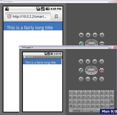
I was struggling to work out a suitable font-size for a mobile web page. Whether I tried using size names like “x-large”, or values with em, pt, px or %, the same basic problem remained:
Font-sizes were either too small on smartphones with high-resolution screens, or too large on other smartphones.
If I increased the font-size to look better on a high-res screen, it was too big for other phones. If I decreased the font-size for those other phones, it looked tiny on a high-res screen.
I know that I could go the whole hog and use something like DeviceAtlas to generate a CSS file customised for the dimensions of the screen, but that is overkill for this quick, simple page I need to create.
I finally found the answer. Put this in the <head> :
<meta name="viewport" content="width=device-width, initial-scale=1.0, maximum-scale=1.0, user-scalable=no" />
With this, the page now looks like this:
It scales properly.
Hurrah. 🙂
Update (10-Aug): And it seems to work this way on the iPhone browser as well. (Thanks to Neil for checking!)


Thanks for the tips. I’m in the middle of developing mobile version of my website and I’ll see if your tips works
Hello,
Thanks for the post and information. As a web designer I recently decided to start marketing a new service for mobile web design which I think will become a huge niche market. Can you share with us your final CSS? Which software simulators are you using fro debugging and any additional information?
I really think this is service will be a specialty, do you agree?
Thanks,
For simulators, I was just using the emulators from the Android SDK.
Kind regards, D
Hi,
Thx for this post! It works 🙂
Regard
it’s not supported on symbian
Thank a lot. This issue have given me lots of problems during the deveopement of the mobile part of our website 🙂
Is there a reason that you’ve included user-scalable=no in your meta tag? All this does is make it impossible for your readers to zoom in or out on your designs. Which, while that might seem good, makes it difficult for people who need the font larger to read it.
All you should need to write in that meta tag is to get the font size to scale appropriately.
Jennifer – Yes, you’re quite right, thanks.
At the time I wrote this post, I didn’t really know why it worked, I copy-and-pasted it and it just did.
I’ve since got my head around why this stuff does what it does – mainly after hearing a talk by Bruce Lawson on Mobile Optimisation for the web. In it, he went through the viewport tags and it finally kinda clicked for me.
Hi,
Thanks a lot. I got a big solution using your idea.
great! it works 🙂
Thanks. That was a great quick fix and a succinct writeup which made it all the better.
thank you so much! I now have a mobile site that works!
Thats great, it helped so much! thanks a lot…
Woo hoo! Thanks, man. I spend forever on this. For the record, this works on Windows Phone 7, too. Huzzah!