 The tabbed interface in my CurrentCost app continues to serve me well. It means I can keep adding new pages to try out new things to display and compare, without spending any time rethinking the interface to make room for another graph.
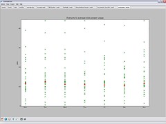
I added another this morning. When you sync the app with the web, it downloads (anonymised) daily power usage values for every registered user, and plots them on a single scatter graph.
I wanted to do this for every stored daily power usage value, but it was unwieldy. I’ve settled for having the web service calculate average daily power usage for each user, and plotting them instead.
 Each cross on the graph for a day represents a different user, which is neat – a nice way of seeing trends. By plotting my own usage in a different colour, I can see where I am in the distribution.
If you’ve not tried my app yet, please do consider it. The more people I can get submitting data to the web service, the more interesting these graphs become!
Tags: currentcost