 Time for number 73 in my never-ending list of ever-so-slightly-different things to try with a graph of home energy usage data
🙂
This time… working out the electricity used (and the cost) of doing… well, something in particular.
We already have live graphs (Switch something on and watch the graph shoot up. Switch it off and watch the line drop.)
And we’ve already got graphs with hourly, daily, or monthly totals.
But if I boil a kettle, how do I know how much that cost?
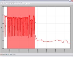
The live graph shows you the shape of the usage curve for a particular appliance.
What I wanted was to be able to start the live graph running, switch something on, then after it’s finished, go back to the live graph, see the bump in the graph for when I did that, and measure the area under it – giving me my total energy usage for that time.
A quick bit of Python-tinkering later, and here we go…
Click-and-drag to highlight a span of the graph, and the Python script calculates the area (more-or-less) under that part of the curve, using this to calculate how much energy I used during this time.


 There was a lot of discussion about how this information could be used to make a difference.
  The tabbed interface in