Okay, I know I said I’d stop banging on about CurrentCost stuff… sorry. My next post will be about something different. Honest! 😉
But with talk about Home Camp 2009 starting to pick up, it seems like a good time to remember one of the interesting factoids I picked up at Home Camp last year.
As I wrote at the time:
…the frequency of the electricity you receive from the National Grid is proportional to the ratio of supply vs demand for electricity usage on a national level…
 There was a lot of discussion about how this information could be used to make a difference.
This is discussed in more depth at dynamicdemand, but the sort of thing we talked about was how you could make a significant difference without reducing your total electricity usage at all, but by shifting your usage to times when national supply is greater than the demand, and so when the energy is cheaper and more efficient to produce.
As I wrote at the time, it might be interesting to see what this looks like plotted against your own personal electricity usage.
Demonstrating my lightning quick l33t development skills, only ten weeks later, I got round to trying it out. 🙂
I found that you can get realtime information from the National Grid website, so this is a good place to start.
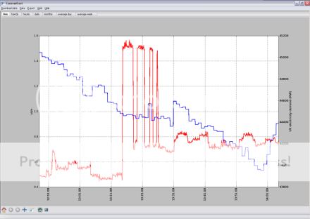
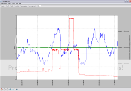
My CurrentCost software has a live tab for showing realtime usage, so the quickest way to test the idea was to overlay data from the National Grid website onto the live graph of personal data.
I’ve written it up in more detail here, but in short, I’ve added a couple of options:
View your own electricity usage compared with the national UK electricity demand

View your own electricity usage compared with the national supply-vs-demand

I’m not saying that it will make a big difference – I’m not exactly planning to run around switching stuff off when I see the National Grid line spike! – but it’s interesting as an educational exercise.
Give it a try – the app is available from http://code.google.com/p/currentcostgui/, and if you don’t have a CurrentCost meter handy, you can still use the program to see the National Grid data by itself.
Or you can see a few screenshots from me running it.
Feedback is, as always, very welcome.
Tags: currentcost, electricity, home camp, homecamp, national grid, smart meter
Update: Jamie pointed me at a very cool presentation explaining the dynamic demand idea on SlideShare that is worth a look.
Thanks for the link, Dale. There’s a video of the talk which that presentation came from at
http://ogn.s3.amazonaws.com/10-TomDyson.mp4
I’d be interested to see another overlay showing how one’s usage compares to the predictable daily peaks – e.g. the big bump when everyone gets home from work and turns the lights on – as well as the dynamic demand noise. This is part of the National Grid real time data; I may include it in caniturniton.com, although the message gets pretty confusing when you have to take into account both (a) current load and (b) how well the grid is coping with the current load.
Chances are the 6 pm peak is electric cooking, not lighting. Cooking on gas might be more help in reducing it.
After all, some office lighting has been switched off by these same people when they left work