 It’s been a while since I posted about CurrentCost stuff, so time to share another little idea.
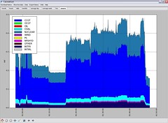
Last night I made a start on adding a new graph type to my CurrentCost application.
Instead of only displaying how much electricity you’ve used, the new graph displays the split of how that electricity was generated.
Realtime figures for the “energy mix” of ratios of different generation methods used in the UK National Grid are available in an XML feed that updates every five minutes.