Posts Tagged ‘matplotlib’

Book review: Matplotlib for Python Developers

Thursday, February 11th, 2010

Matplotlib for Python Developers, Sandro Tosi

Let me get the boring disclaimer-y bit out of the way first: I didn’t buy this book – Packt Publishing sent me a free copy in return for me writing a review of it. They’ve not made any specific requests about the contents of my review, just that I should write a review. And, in fact, I should give them props for not hassling me for not getting around to writing this until now – about eight weeks after they sent it. So either they forgot they sent it to me, or they are terribly patient. I’m choosing to assume it’s the latter 🙂

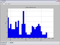
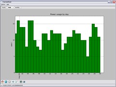
With that out of the way… matplotlib is a graphing library. I’ve used it a lot for my CurrentCost energy monitoring app – all of the graphs in the app are created using matplotlib. And while it is very powerful, it can be a little tricky to get your head around. I still struggle with getting the graphs exactly how I want them even now.

That was why I agreed to do this review – I liked the sound of the book and thought it’d be useful for me.

Overall, it’s a really good book. It starts off going through all the basics, both in terms of explaining the ideas and concepts, and in the practical steps needed to get set up. I’m not normally a big fan of reading text books, preferring to figure stuff out for myself as I go along, but found that even here I picked up tips that I never knew and subtle features that I’d missed.

A nice flow-chart kicks off the detail into producing different types of graphs and chart. It starts from asking “What would you like to show?” (e.g. comparison; distribution; composition; relationship; etc.).

Following this through for what you want to show, and what type of data you have, leads you to a suggestion for the type of graph that is most appropriate for your needs (e.g. line histogram; waterfall chart; pie chart; stacked column chart; scatter chart; etc.). For someone like me who doesn’t have the world’s strongest maths background, this was a really useful guide.

(more…)

How much did I spend on electricity to do that?

Friday, November 27th, 2009

Selecting a chunk of a graphTime for number 73 in my never-ending list of ever-so-slightly-different things to try with a graph of home energy usage data

🙂

This time… working out the electricity used (and the cost) of doing… well, something in particular.

We already have live graphs (Switch something on and watch the graph shoot up. Switch it off and watch the line drop.)

And we’ve already got graphs with hourly, daily, or monthly totals.

But if I boil a kettle, how do I know how much that cost?

The live graph shows you the shape of the usage curve for a particular appliance.

What I wanted was to be able to start the live graph running, switch something on, then after it’s finished, go back to the live graph, see the bump in the graph for when I did that, and measure the area under it – giving me my total energy usage for that time.

A quick bit of Python-tinkering later, and here we go

Click-and-drag to highlight a span of the graph, and the Python script calculates the area (more-or-less) under that part of the curve, using this to calculate how much energy I used during this time.

(more…)

How to customise the NavigationToolbar2 toolbar in matplotlib

Saturday, June 6th, 2009

My CurrentCost desktop software is written in Python, and uses the matplotlib library for plotting graphs.

I am a big fan of matplotlib – you can create some very cool graphs with it. It’s not without it’s issues… for example, I’ve still yet to work out how to do realtime graphing with it that isn’t massively inefficient and resource intensive. But that’s for another post 🙂

One of the nice things that you get with it is a toolbar that lets the user switch between different modes that the mouse supports – zooming, panning, and so on.

Adding the toolbar is straightforward – I create an object of the class NavigationToolbar2Wx and add it to a sizer which in turn I add to the graph Plot.

self.toolbar = Toolbar(self.canvas)
self.toolbar.Realize()
sizer = wx.BoxSizer(wx.VERTICAL)
sizer.Add(self.canvas, 1, wx.EXPAND)
sizer.Add(self.toolbar, 0 , wx.LEFT | wx.EXPAND)
self.SetSizer(sizer)

The NavigationToolbar2 toolbar provides a number of features but it doesn’t exactly meet my needs so last night I had a go at customising it.

I wanted to:

  • remove the configure subplots button – as I don’t use subplots in my graphs
  • add a couple of new buttons – for different navigation abilities

I couldn’t find this documented clearly anywhere, so thought it was worth sharing the code that I came up with.

(more…)

CurrentCost app … take 2!

Saturday, August 30th, 2008

a Python CurrentCost appI’ve been talking about it for a while, but I finally got around to spending some time working on a CurrentCost app.

The original code was written in C# using .NET 3.5, and I used WPF (Windows Presentation Foundation) to draw the graphs. For a number of reasons this proved unpopular and I got a ton of emails saying how this was no good for them. So I decided to start again.

The new app is written in Python – using wxPython and matplotlib to create the graphs.

a Python CurrentCost appUsing py2exe, I’ve been able to compile the whole thing (combining my script with a Python interpreter and a copy of all of the third-party libraries I’ve used) into a Windows executable that will (hopefully!) run on any Windows computer, without needing installing or requiring any pre-requisites.

I can also make the Python script itself available, making it something that Linux users could run as well. This means I get the low-overhead Windows experience I wanted, together with the ability to make it cross-platform. Neat!

I’ve been able to produce some more interactive graphs – the graphs in the new app can be zoomed in and out, panned, moved around, printed, and exported to images. As the amount of data in the app builds up, I can see this becoming very useful.

(more…)