I’ve mentioned several times before how easy Visual Studio makes it to knock up mobile applications. This is one of my favourite aspects of Windows Mobile. Why put up with an interface that doesn’t work for you? If you’ve got a spare hour, make a customized interface that gets your phone to work in way that suits you better. You can create a new interface (a ‘form’) without knowing any code – just drag-and-drop to put buttons, pictures and text where you want them. Then fill in the empty methods to get the buttons to do stuff – most of the core applications expose an API that let you drive them from your own forms.
In this post, I’ll go through an example – what I didn’t like about the WM interface, why it didn’t work well for me, and how I hacked together a new interface this evening.
I use Egress as a podcast aggregator on my phone. It downloads podcasts overnight (using my home wifi) direct to my phone, which I listen to in the car.
The way that I can start them playing – while driving – is frustrating, so this is what I tackled tonight. The problem is that the mobile Media Player doesn’t have a file-browse ability to find these newly added mp3 files, and files not synced from desktop Media Player don’t get added to the Library. So you have to launch them from the File Explorer. This involves:
1. Click on the start menu 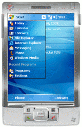 |
2. Start the File Explorer 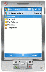 |
3. Go up to the root folder 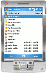 |
4. Open the Storage Card folder  |
5. Go into the Podcasts folder 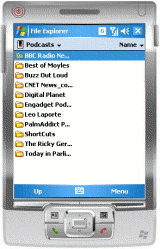 |
6. Go into a directory for one of the podcasts 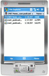 |
7. Click on one of the podcasts and away you go!  |
A bit of a pain. Especially when driving. The controls to navigate the File Explorer (while fine in most other circumstances) are small and fiddly. And with some of the podcasts being quite short (like the daily CNET News podcast which is typically 5 – 10 minutes long), this means you have to do this again 10 minutes into your car journey!
 So, I decided to put together something more appropriate for my needs. A simple interface to launch the different podcasts – with buttons big enough I can quickly jab them with a finger.
Created in Visual Studio, the code essentially wrote itself. The whole thing took about half-an-hour (most of which was spent finding images to steal borrow for the buttons!). I drag – and – dropped the images to where I wanted them, then double-clicked on each one to create a method to be called when they are clicked on. I then filled each in those methods with a call to my launchPlaylist method.
The code looks like this:
private void launchPlaylist(String path)
{
    ProcessStartInfo mediaPlayer
        = new ProcessStartInfo("wmplayer.exe",
                               "\"" + path + "\"");
    Process.Start(mediaPlayer);
}

/* one of these methods (below) for each button */
private void btnCNET_Click(object sender, EventArgs e)
{
    /* where CNET is a string containing the playlist path */
    launchPlaylist(CNET);
}
This starts Windows Media Player to play the selected podcast. Media Player, being the most recently started application, then fills the screen. (The ability to launch minimised applications, although possible in .NET, is not included in the .NET Compact Framework you get on Windows Mobile).
I did consider playing the mp3s within my launcher application itself, without using Media Player. This can be done like this:
/* need to add a reference to the media player dll in Visual Studio */
WMPLib.WindowsMediaPlayer wmplayer = new WMPLib.WindowsMediaPlayer();
wmplayer.URL = CNET;
wmplayer.settings.volume = 100;
wmplayer.controls.play();
I decided against this because I like the controls (pause, volume control etc.) that I get with the full Media Player (especially with the Voice Command skin I use), and saw no point in re-implementing them in my launcher. If nothing else, it would’ve taken up space I’d rather use making my buttons as big as possible. Once a podcast has finished I can close the Media Player easily enough, returning me back to the launcher to start another.
And that’s it.
I’m not claiming that the Windows Mobile interface is bad, or that my approach is better – that’s not the point that I’m trying to make. The point is that it’s better for my needs. And if, after trying it on the way to work tomorrow I find that it’s not quite right, I can change it until it is. This is very cool – I can tweak and hack my phone until it is the device I want.
I realise that I’m not a typical user, and that most people aren’t going to want to do this. Even so, I hope that Apple does change their mind about allowing developers access to the iPhone as this (and the price!) is probably the bit that disappointed me most in the iPhone release blurb.
In fact, far from locking it down, we should be making it easier for consumers to do this. Isn’t customizability and personalisation still supposed to be an ‘in’ thing? Why not at least make interfaces that are easy to skin? Or are different coloured covers as good as it gets?
nice idea!
what podcasts does your program start? can they be changed?
Thanks for the comment. Starting from top-left, the podcasts that I subscribe to are:
As for changing them… I’d have to change the code and images, then recompile it. But that isn’t a lot of work. I really only wrote this for my own use, so I took the lazy way of hard-coding in the paths to the podcasts!
what does the Refresh button do?
Well spotted! 🙂
I delete the podcasts after I listen to them, so I might not have all of them to listen to when I start the launcher app.
So, when you click ‘Refresh’ I check to see if the playlist file exists, and if it doesn’t, I disable the podcasts’ button and grey-out the image.
(toggling between the images and disXXX images which are greyscaled versions of button images)