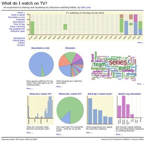
I revisited the code behind my TV scrobbling this evening. When I first wrote it, I focused on graphs like bar graphs and pie charts.
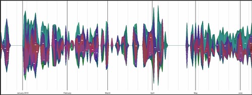
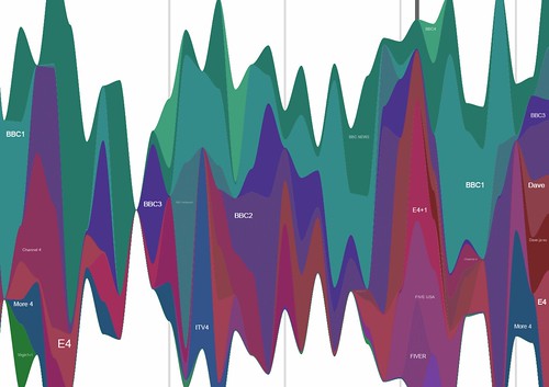
Tonight, I tried out wave graphs. In this post, I want to share some of the results of my first attempt, and how I wrote the script to generate them.
I have created wave graphs showing my TV watching over the last five months. I’ve tried splitting it out by in a couple of ways:
- by channel (pdf, insanely-big-png, svg)
- by programme title (pdf, svg)
Programme titles tend to be too long to make for a very useful graph, and there were way too many of them. But I’ve tried limiting them to the top 10 watched programmes to make for a prettier graph. The channels graph seems to work okay, though.
To generate the graphs, I wrote a Python script using the awesome graphication graphing library by Andrew Godwin.


