I revisited the code behind my TV scrobbling this evening. When I first wrote it, I focused on graphs like bar graphs and pie charts.
Tonight, I tried out wave graphs. In this post, I want to share some of the results of my first attempt, and how I wrote the script to generate them.
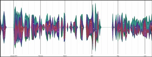
I have created wave graphs showing my TV watching over the last five months. I’ve tried splitting it out by in a couple of ways:
- by channel (pdf, insanely-big-png, svg)
- by programme title (pdf, svg)
Programme titles tend to be too long to make for a very useful graph, and there were way too many of them. But I’ve tried limiting them to the top 10 watched programmes to make for a prettier graph. The channels graph seems to work okay, though.
To generate the graphs, I wrote a Python script using the awesome graphication graphing library by Andrew Godwin.
There isn’t a lot of documentation for it, but it’s pretty straightforward:
1. – Install the pre-reqs – I already had Python, so just needed to install pycairo
2. – Check out the library source from the SVN server, and run the setup.py as usual to install
3. – Write a script 🙂
There is already a useful sample script that was enough to get me started, but I’ll expand on it slightly here.
I have my TV watching data in an SQLite database, so it was pretty easy to write something to grab the data I need. Stripping out the stuff that’s specific to my database structure, the basics of a graphication script is:
from datetime import datetime
from graphication import *
from graphication.wavegraph import WaveGraph

# an arbitrary set of dates
#  see the note below about the need for consistent set of dates
d1 = datetime(2010, 6, 1)
d2 = datetime(2010, 6, 2)
d3 = datetime(2010, 6, 3)
d4 = datetime(2010, 6, 4)
d5 = datetime(2010, 6, 5)
d6 = datetime(2010, 6, 6)
d7 = datetime(2010, 6, 7)
d8 = datetime(2010, 6, 8 )
d9 = datetime(2010, 6, 9)

# place to store the data
series_set = SeriesSet()

# some canned data sets
series_set.add_series(Series("BBC1", {d1:0.5, d2:1.0, d3:0.2, d4:0.8, d5:1.1, d6:0.9, d7:0.7, d8:0.6, d9:0.4}))
series_set.add_series(Series("BBC2", {d1:0.2, d2:0.9, d3:0.3, d4:0.7, d5:1.5, d6:1.2, d7:0.9, d8:1.0, d9:0.7}))

# notice that if you use a date in one
#  data set, you seem to have to use
#  it in all of them - so I had to
#  make sure I inserted a value of 0
#  for days where I didn't watch a
#  particular channel
series_set.add_series(Series("BBC3", {d1:0, d2:0, d3:0.1, d4:0.2, d5:0.3, d6:0.2, d7:0.1, d8:0, d9:0}))

series_set.add_series(Series("BBC News", {d1:0.8, d2:0.8, d3:0.8, d4:0.8, d5:1.1, d6:1.1, d7:1.1, d8:1.0, d9:0.4}))


# define the appearance
import my_css as stylesheet
clr = Colourer(stylesheet)
clr.colour(series_set)

# specify the graph scale - you can choose from
#  DateScale - the basic, you need to specify the min and max date
#  AutoDateScale  - works out the min and max dates for you
#  AutoWeekDateScale - divides up months and weeks with major/minor lines
#  WeekdayDateScale - only plots data on weekdays, not weekends
datescale = AutoWeekDateScale(series_set)

# create the wave graph
wg = WaveGraph(series_set, datescale, stylesheet, label_curves=True)

# write it to files, in variety of file types
output = FileOutput(stylesheet)
output.add_item(wg, x=0, y=0, width=445, height=150)
output.write("pdf", "yourgraph.pdf")
output.write("png", "yourgraph.png")
output.write("svg", "yourgraph.svg")
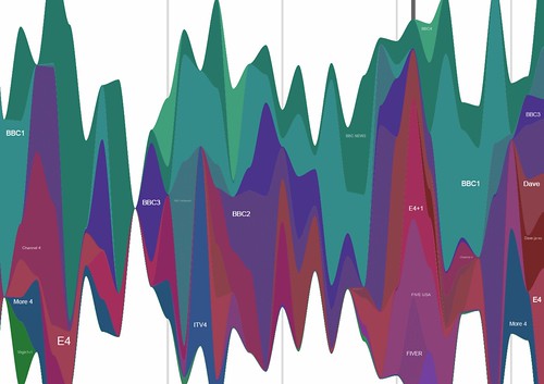
If you run that, you get something like this:

And that’s all there is to it.
Although I could automate this, I’ve chosen not to for the moment, so the graphs wont be appearing on dalelane.co.uk/tvscrobbling yet.
This is because I haven’t managed to find a decent balance between making the images so huge that hosting the files would bring my site down, or making the images so small that the labels are unreadable. (For now, I’ve run the script once and used flickr and dropbox to host the files.) I’m not sure what the best answer is for this, but I’ll have a think about it.
[…] a new client at work last month, and getting distracted (like the goldfish that I am!) with other bits and pieces, I kinda forgot about this code after starting it last […]
Hi,
im trying to do something similar! Do you know where i can change the resolution of the output? on that site: http://lastgraph.aeracode.org/ you can define some resolutions – or better the detail level!
i was looking around in the code examples for houres, but i couldnt find anything. Any Idea?
Thanks!
pcace – The resolution is set in the
output.add_item(wg, x=0, y=0, width=445, height=150)line, isn’t it?Hi, just a quick thanks for popping up out of the blue. I have been wondering for a while how to translate my rather complex medical graphs into easily visible multi-layered images. I came across your blog while searching for novel uses of Google Latitude and Whammo! … both my questions were answered…great site! I will be following in future.
Andre J Smith