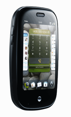
 I’ve had the Palm Pre for nearly a week now, so I thought that it was worth a quick post!
If you want to save yourself reading the rest of the post, I can summarise it for you here: the Pre is an awesome, pocket-sized piece of loveliness.
I love it. 🙂
I should probably qualify this, though – I am a longtime Palm fan… having previously bought a Palm Pilot, Palm IIIx, Sony Clie UX50 (which ran Palm OS), Palm Treo 650, Palm Treo 750 and Palm Treo Pro.
And if they hadn’t killed the Foleo before launch, I was gonna get that, too.
I was always going to want the Pre. But it really has met my expectations. It’s the device I wanted them to produce so I could justify my Palm devotion to the naysayers who were only recently predicting Palm’s demise.
There are already a ton of Pre reviews out there, so I probably shouldn’t duplicate too much of what has already been said. But there are so many things to highlight…
Hardware
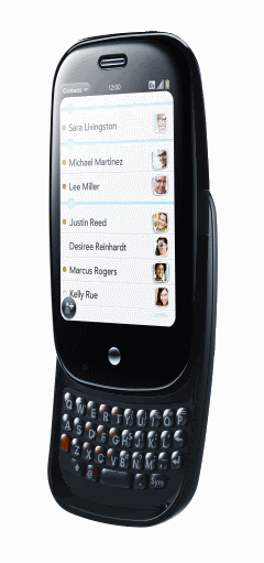 The Pre itself is very nice. I like the rounded pebble feel, and it feels reliable and solid in your hand.
The keyboard is close enough to what I’m used to on the Treo Pro that I’m able to type on it reasonably quickly.
The screen is fantastic – a sharp, clear display that is showed off well by the default wallpaper images that the phone comes with.
The camera is fantastic – definitely the best camera I’ve had on a phone (although that isn’t saying much to be honest, as the HTC phones I’ve had before have all had pretty rubbish cameras).
It’s not all perfect… I’d have liked it to be a little bigger, but I guess that comes down to taste. The top of keyboard is really too close to the slide-up screen, which is a little uncomfortable… I think they would have been better to leave more space between the screen and keyboard.
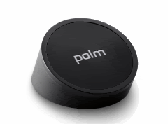 The real surprise has been the Touchstone. I got it thinking it would be a neat gimmick. It has been much more useful than I thought it would be – I am very glad that I got it. I charge my phone at my desk while I am at work, which means that whenever I left my desk I used to have to unplug my phone, then plug it in again when I got back. I never really thought it was a big deal, but now that I just pick my phone off the Touchstone and walk off, and then just put it back on the Touchstone when I get back, I wouldn’t want to go back. For one thing, it’s quicker – if I leave my desk a dozen times a day, that is a dozen times I don’t have to fiddle around opening the little plastic flap and wiggling the cable in. However, perhaps more importantly, it’s probably better for the phone – after being plugged and unplugged so many times, the micro-USB cable in my Treo Pro is quite loose, and wobbling it around in the socket can make it drop the connection.
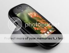 And there are other neat touches… like I love how putting the Pre on the Touchstone while you’re on a call automatically puts it in speakerphone mode.
It is still overpriced… but there’s probably an element of early adopter’s tax here, so I can’t bash Palm too much for the cost. That said, the fact that the Touchstone comes without a plug or cable. I wanted to use the Touchstone at work, and use the plug and cable that came with the Pre at home. But you need to either buy another USB cable and plug separately, or reuse the plug and cable to make the Touchstone work.
For an accessory that is already about £50, this seems miserly – if I’m spending £50 on a neat gadget to charge my phone, it wouldn’t kill Palm to include a plug with it!
Software
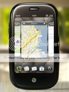 webOS is genius. There is so much to love about it. The cards metaphor (where each app is treated as a card that you can sort and flip between) works amazingly well – I’ve never seen a mobile OS where switching between apps is so easy or natural.
The notifications system is awesome. When a notification is received, the app you are in shrinks in height slightly to make room for a notification panel at the bottom. It doesn’t put a new notification dialog over the top of what you were doing.
And crucially, it doesn’t steal focus – so you can carry on doing what you were doing until you are ready to look at the notification. Really, really neat.
 (Is it really true that on the iPhone if you receive a call writing something in a form on a webpage, you lose everything you’ve written when the browser is closed to show the incoming call notification?)
The gestures are very natural. Delete something from a list by swiping it off the left or right side. Close an app by swiping it up, throwing away the ‘card’. Pinch to zoom. Go back by swiping from right to left in the off-screen touch-sensitive area below the screen. Get to the launcher by dragging it up from the off-screen touch-sensitive area. And so much more – it’s all very slick. It’s actually fun to use… I still sometimes open an app just so I can throw it away again. (Yes… I am a little odd)
Synergy is a work of genius. My diary and contacts is sucked in from multiple sources (like Gmail Contacts and my Facebook address book, or multiple Google Calendars and Facebook events…) and all merged on the phone. This gets even better when you grab multiple event sources into Google Calendar – like birthdays of friends on Facebook, events from Upcoming, etc. And they each show up in the Pre’s calendar with a different colour code, and you can toggle any one on or off if you want.
Universal search is sweet – a search bar that can search any data on the phone, as well as Google, Wikipedia or twitter. It’s a very cool feature, and a quick way to jump to something either on or off the phone when you know what you want.
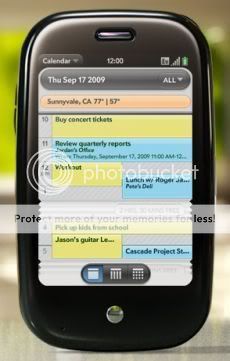 And again, there are neat thoughtful touches throughout. I love how the icon for the calendar app changes to show the current date, so you can see today’s date at a glance. I love how the calendar collapses free time in a concertina way, so you can see more of your day on screen at once. Each idea perhaps minor by itself, but together it adds up to a very polished experience.
It’s not all perfect, and in places you can see that this is a first release of a new OS. Such as an email app with dedicated gmail support… that offers a way to delete an email, but not archive. I’m relatively new to gmail, but even I know that gmail is all about archiving everything and not deleting. (Okay, there is a workaround, but this is still a good example of the sort of niggly oversight that Palm should fix.)
Or an email app that offers polling intervals of every 1 hour, or every six hours… but nothing in between – am I being unreasonable to want to be able to choose every two or three hours?
The web browser is very slick on the whole, but there are some issues… particularly with “mobile-friendly” pages. The browser takes the approach of showing the page as it would be on a desktop browser, and letting you pinch-to-zoom in. But this means it doesn’t try to wrap some pages that it really should… dabr, for example shows tweets in text too small to read when you open the page. But when you zoom in, it doesn’t reflow the page so you have to scroll left and right to read the whole message. Similar problems occur in other mobile web apps… mobile Google Reader zooms in too much when viewed horizontally, and so on. But these are niggles… and mainly with “mobile web pages”, because webOS is trying so hard to look like a desktop web browser.
The only low point is the crappy desktop data transfer setup software they ship with it, that I couldn’t get to work. Luckily it’s not that important, but still pretty rubbish.
These are niggles, though. webOS is really, really fantastic. Palm took way too long to release it, but they really came out with the best mobile OS I’ve ever used.
Being with O2
I’ve been with T-Mobile for a couple of years now, with the G1 and before it the Ameo, so it’s been interesting to make the jump to O2.
Overall, I’m pretty impressed – their coverage is so much better where I live and work. Being with T-Mobile for so long I’d sort of got used to the idea of my phones as primarily PDAs – they were useful as stand-alone devices, and I so rarely had a connection that it was mostly about the native apps working offline. And on my drive home from work, my phone would go nuts with all the voicemails and text messages I’d missed during the day.
But now I can be still make and receive calls, while I’m in the office. After not being able to for the past two and a half years, it’s actually quite a novelty.
I have had a couple of issues. I can’t send email from one of my accounts… I think it might be because O2 are blocking port 25, but I’ve not had the chance to look into it properly.
More annoyingly, the Pre is shipped with an old version (1.1.3) of webOS. It’s annoying enough that the UK has to late for so long to get the Pre after the US release, but it’d be good to finally get it with the current release. Here’s hoping O2 will help get 1.2.x out to us soon. Not only will it fix a few bugs in the core apps and add some neat new features, it also means we can get some of the new versions of third-party apps I’ve read about in the US – like the LinkedIn app with Synergy support to add your LinkedIn contacts to the Pre’s contacts list.
Time to stop rambling
I’ve written more than I intended to… mainly because I can’t help gushing about the Pre. As I said at the start, this phone is a piece of brilliance. It reminds me of the new HTC ad about the idea of a mobile that is with you throughout the day supporting whatever you want to do, as a seamless part of your day.
Nice write-up Dale – I’ve been meaning to do one myself but might not bother now 🙂
Two things:
– You can archive Google mail, just move it to the ‘All Mail’ folder
– Did you know you can take screenshots? Orange + Symbol + P 🙂
Thanks!
The move-to-All Mail is basically the workaround I meant… and you can set “All Mail” as your Trash folder, then you can still use the nice swipe gesture to archive.
It’s still a bit of an oversight on Palm’s part… and if nothing else, I had to think of some negative things to say! 😉
The screenshots thing is a nice tip – hadn’t realised that, thanks!
As an iPhone user that is a convert from Palm, I am very very happy to see Palm’s success with the Pre. They truly needed a hit. They are again a player and competition is good for all of us. I would hate to see the mobile smartphone market become an iPhone vs Android history repeating the Mac vs Windows of the desktop environment. The more the merrier is what is best for consumers — iPhone, Palm, Android, BlackBerry, Symbian, Windows Mobile… well, maybe not Windows Mobile.
I’m also a big fan of Jeff Hawkins (loved his book, On Intelligence). Glad to see his creation given a new lease on life (Even if they had to steal Jon Rubinstein from Apple to make it happen… heh-hem).
Here is my over-geeked signature from the BrightHand forum:
http://www.chrisgrayson.me/posts/PDAs.gif
Dear Dale,
Finally! So when do we get Blade wiki on the pre? 🙂 No just joking. You say that the universal search search everything. But I can not get it to search notes in contacts. Do you know how?
Kind regards,
Anders H.
Anders – Dunno, sorry. It’s a good point though… I’ve looked into how I could extend the Pre’s search providers list, but it doesn’t look very pluggable 🙁
So what are you doing for on-the-go notes/gtd these days?
I’ve been living off the bLADE Wiki ever since you created it… (ever since you made the NoteStudio export app, actually!)… because I’ve been on PocketPC/Windows Mobile devices.
I’ve been playing with Evernote, because it seems to have a client for everything (except Symbian). But your text-file convention is SO much more robust, portable, and just plain faster!
Anyway… mostly just wanted to know what you’re doing these days to keep your “stuff out of your head.”
At the moment, I’m still using the Treo Pro, albeit often without a SIM card, purely for bLADE Wiki.
I also have a simple viewer for Android that lets me have read-only access to my wikis. I’ve not written that for the Pre yet, though.
I’ve had my Pre due to the fact shortly right after release and am glad to find (by means of this forum) that I can now set a ring tone on incoming text messages and can seek via e-mails and this kind of. Now is there any hope for an upcoming release where I can look for my calendar? Would make my occupation a great deal less difficult, acquiring dates of last appointments. No other complaints, except that yesterday I used to be in and out of Sprint support (not unusual). I believe I was roaming, and looked at my calendar. Every little thing from the calendar was 1 hour earlier than what I had input. The clock was just one hour early as well. I used to be frightened to death–then, the moment we got back into Sprint program yet again, everything was normalized. Has this happened to anyone else?? Seeking forward to answers, but please don’t forget, I’m no techie and speak English as opposed to technospeak.