I’d like to think that I’m normally a fairly easy-going person, but we all have our pet peeves and for me one of mine is my mobile phone network operator. They drive me nuts – I never get a signal anywhere!
Or at least, so I thought.
Last night, I put together a quick test to keep track of how much time my phone doesn’t have a signal.
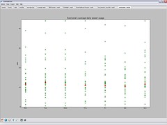
It is technically very simple to do, but I’ll describe how it works in a moment. First, the results. Today was a “typical” work day – I spent most of it at my desk which is by a window on a first floor. I don’t work in a lead-lined bunker, and I didn’t hide the phone in a microwave (does that even work?) or anything like that.
 I started the test at home this morning, when I normally start checking my emails and twitter. And it’s been running all day. While in my office, the phone was on my desk. The rest of the time it’s been in my pocket.
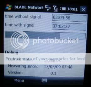
It looks like I have a signal more often than I thought – for over seven hours it had a signal, with only a little over three hours with no signal. I was expecting a result with time without a signal being greater than time with a signal.
This is hardly a scientific test, but I wonder if my perception is worse than reality? Maybe all it takes is a few times for the phone to not have a signal when I need it for me to get the impression that it “never” has a signal.
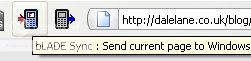 This post is a complete sample for creating a Firefox extension to add a button to the browser toolbar. When you click on the button, it grabs the URL from the Firefox address bar and does something with it.
 There was a lot of discussion about how this information could be used to make a difference.
 The tabbed interface in