Another CurrentCost app update

January 4th, 2009

The tabbed interface in my CurrentCost app continues to serve me well. It means I can keep adding new pages to try out new things to display and compare, without spending any time rethinking the interface to make room for another graph.

I added another this morning. When you sync the app with the web, it downloads (anonymised) daily power usage values for every registered user, and plots them on a single scatter graph.

I wanted to do this for every stored daily power usage value, but it was unwieldy. I’ve settled for having the web service calculate average daily power usage for each user, and plotting them instead.

plotting everyone's CurrentCost readings on a single scatter graph
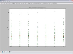
Each cross on the graph for a day represents a different user, which is neat – a nice way of seeing trends. By plotting my own usage in a different colour, I can see where I am in the distribution.

If you’ve not tried my app yet, please do consider it. The more people I can get submitting data to the web service, the more interesting these graphs become!

Vtech Kidizoom

January 1st, 2009

Top of Grace’s Christmas list for Father Christmas was a camera.

In the end, Santa went with the Vtech Kidizoom.

Faith - Grace's baby sisterIt was tough to find many reviews for it, so I thought I’d share a few of Grace’s snaps with it so far, for anyone interested to see what the image quality is like – all of the photos in this post were taken by Grace (our 4 year old) with the Kidizoom.

The camera cost £40, and produces JPEGs with a resolution of 640×480. There is about 12 MB of storage in the camera, which has enough space for at least a couple of hundred pics, and an SD card slot if you need more space.

DC00029

The pictures are a little fuzzy, but Grace is certainly happy enough with them.

The camera does have a flash, which means indoor pics are possible.

It can be tricky getting the distance right when using the flash – too far away and the flash is no use at all and the picture is very dark, too close and the flash is too bright creating a bright white picture. (Although this has created a couple of neat pics such as this one!)

Read the rest of this entry »

CurrentCost – the CC128

December 29th, 2008

CC128 - the new display unitThe nice people at CurrentCost were kind enough to let me have a pre-production version of their next home electricity monitor to play with: the CC128.

I’ve been meaning to post some thoughts about it for a few weeks now, but the run up to Christmas meant it got forgotten.

But I finally had a bit of time to give it a try today.

If you already know about CurrentCost meters, nothing here will surprise you – this is more of a refinement to the current design, rather than something new and different. (If you don’t, I’ve written about CurrentCost meters before – this new one is just the same, except with a new display unit).

There are some improvements here that I like.

Read the rest of this entry »

Crisis Christmas

December 29th, 2008

I’m not normally one for habits or routine, but Christmas is an exception – it’s one time when I’m happy, if not actually quite comforted, to do the same stuff I do every year. Traditions are part of the festive magic.

One of my traditions, which started for me when I was at Uni, is to go up to London for Crisis Christmas – the annual homeless shelters event organised by Crisis.

Crisis Christmas provides over a thousand people with a warm, dry place to spend the festive period, and somewhere to share a meal and watch some Christmas telly – the stuff that we all take for granted.

But it’s more than that. People from various specialties and professions volunteer their services, making the Crisis shelters also an opportunity to see a doctor, get a healthcheck – even an X-ray (useful for detecting TB), see a vet (important to the many homeless people who have dogs), see a dentist, a hairdresser, a chiropodist (vital to a group of people whose feet are so often cold and damp, where even getting trench foot is not uncommon), an optician, a pharmacist, get help writing a letter or filling in forms, talk with advisors such as benefits advisors, housing advisors, legal advisors, and loads more.

Read the rest of this entry »

Drawing pretty graphs with Open Flash Chart

December 19th, 2008

I’m keen for young people that Solent Youth Action works with to have access to information about how the charity runs. I’d like for us to be as transparent as possible, and as a geek, one of the ways that I am working on this is by putting more stuff on our website.

We put our Financial Statements online so that people could see where we get our money from, and how we spend it. But it’s a dry document – a twenty-two page PDF of numbers and accounting blurb.

While it is important for this information to be available, it’s not easily accessible to many like this. Tonight I had a play with presenting it as animated online graphs using the awesome Open Flash Chart.

The Open Flash Chart site has very clear tutorials and a ton of examples, so I wont waste time here by going into detail explaining how to use it.

But it’s worth highlighting just how simple it is – drop the swf file into a directory on your webserver, then point it at a JSON file with your data (either by URL, or by reference in your HTML). That’s pretty much it.

The most complicated bit was copying figures out of the Financial Statements document and pasting it into a JSON text file. Even this was fairly quick.

Flash graphs are not as accessible as something like Google Chart images because they require Flash to be installed. However, I hope the visual flair they add makes up for this, and will help grab the attention of our volunteers.

I created a couple of quick charts to show our income and expenditure, but there are many more examples of how to use it here and here.

Lapland UK

December 16th, 2008

On Friday, we took the kids to Lapland UK.

The first reaction I got when I mentioned this to people generally went along the lines of “OMG, you’re going there?! I heard about them in the news!”.

It’s not the same place. This isn’t the New Forest Lapland-themed attraction that made the headlines so spectacularly a couple of weeks ago – it’s a place in Kent.

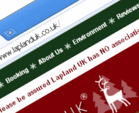
Even their website has a banner on the top to reassure visitors saying: “Please be assured Lapland UK has NO association with Lapland New Forest”.

Hmmm… I guess they have a bit of a brand problem, at least in the short-term.

With this in mind, and as we had such a lovely day there, I thought I’d do my little bit to help their image by sharing our experience.

Read the rest of this entry »

A letter to Littlewoods Direct. Or why you’ve got to read the small print

December 15th, 2008

People who follow my tweets may have already heard my moaning about Littlewoods on Friday, but I’m still hacked off about it enough to post about it here too.

I have written them a letter (in the perhaps misguided belief that paper letters get more attention than emails). The contents are posted below to share my ranting and whining more widely.

Comments are very welcome… am I being too ranty and unreasonable? How much responsibility do we consumers have for reading small-print?

Read the rest of this entry »

CurrentCost – setting yourself a personal goal

December 14th, 2008

One of the themes that came up at HomeCamp was that collecting data about personal energy usage was good, but putting it in a broader context helped make it more effective.

With that in mind, I thought I’d make a small improvement to my CurrentCost app to add a financial context to the data it displays.

I’ve added the ability to specify an annual electricity usage target – it asks the question “How much do you want to spend on electricity in a year?”

screenshot
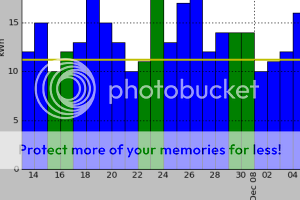
Once you answer that, a target line is added to each graph. The target line shows how much electricity you should use in order to meet your goal.

For example, the graph showing daily electricity usage has a horizontal line showing how much electricity usage you can use a day in order to meet your target annual electricity spend. Bars in the graph that are taller than the horizontal line show you exceeding your goal, bars that stay under show you on track.

Read the rest of this entry »