Posts Tagged ‘python’

Annotating photos with tweets

Sunday, September 11th, 2011

I have a lot of digital photos.

An insane amount – something like 40,000 photos that go back over a dozen years since I first got a digital camera at University.

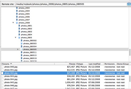
I store them based on the date that they were taken, using a folder structure like this:

screenshot of folder structure where I store photos

For a while, I used to drop a readme.txt text file into some of the folders saying where the photos were taken or what I was doing. This was partly so that when I look at the photos ten years later I’ve got something to remind me what is going on, but mainly to make it possible for me to search for photos of something when I can’t remember the date it happened.

But in recent years, I’ve been too lazy to keep that up, and rarely ever add a readme file.

I thought that my tweets might be a good alternative. There is a reasonable chance that if I took a photo of something interesting, that I might have tweeted sometime that day about where I am or what I’m doing.

I wanted to populate each of my folders with a day’s photos in it with a tweets.txt text file containing tweets posted on that day.
(more…)

Counting my key presses

Friday, June 3rd, 2011

Overview

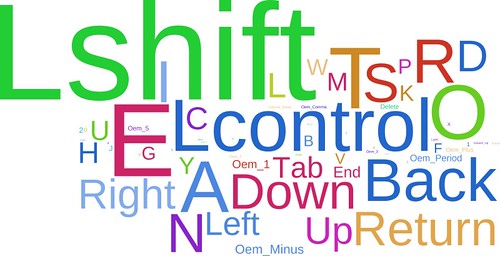
Counting and visualising which keyboard keys I press the most often

keypress distribution

Background

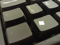
the left Ctrl buttonI noticed something yesterday.

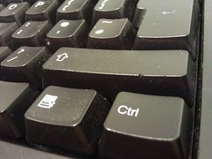
The lettering on my left Ctrl button is a lot more faded than the lettering on my right Ctrl button.

I must press the left Ctrl button more often than I do the right one.

That got me looking at the rest of the keys on the keyboard. Some of them are faded, too. Some a little, some a lot.

the right Ctrl buttonI must press some of those keys more than I do others.

I’ve played hangman, so I know that there are some letters that occur more frequently in English words than others. So I could have just said that those are the keys I probably use the most and left it at that.

But… I don’t spend that much time writing documents or large chunks of English.

I’m a code monkey. I’m not sure that distribution would necessarily apply to me.

For example, I probably use the semi-colon key quite a lot – at the end of every line when writing in some languages. That wouldn’t be true for people writing English.

So I wondered how much I use each keyboard key in comparison to each other.

Being an obsessive compulsive geek, I couldn’t leave that as an idle wondering. I had to find out. I had to go and get the data.

(more…)

How to generate a wave graph

Thursday, June 10th, 2010

TV watching - split by channel

I revisited the code behind my TV scrobbling this evening. When I first wrote it, I focused on graphs like bar graphs and pie charts.

Tonight, I tried out wave graphs. In this post, I want to share some of the results of my first attempt, and how I wrote the script to generate them.

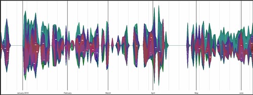
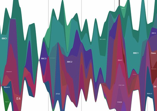
I have created wave graphs showing my TV watching over the last five months. I’ve tried splitting it out by in a couple of ways:

Programme titles tend to be too long to make for a very useful graph, and there were way too many of them. But I’ve tried limiting them to the top 10 watched programmes to make for a prettier graph. The channels graph seems to work okay, though.

TV watching - split by channel

To generate the graphs, I wrote a Python script using the awesome graphication graphing library by Andrew Godwin.

(more…)

My Google Latitude History as a heat map

Friday, May 28th, 2010

Update (8 May 2011): I revisited this a year later to make a version that you can try online with your own Latitude data
Update (15 Jan 2012): A fixed version of the code to handle the new Google Latitude file format.


Google Latitude is starting to get very interesting. The new dashboard lets you see some graphs of how much time you spend at work, home, and out and about, and a list of your most visited places.

You can also see a Google Map with your 500 latest updates added as pushpins.

I had a random idea while looking at it this evening – why don’t they let you see all your updates on a map, in a heatmap that shows where you’ve been?

Naturally, once I had the idea, I had to give it a quick try.

This is the result:


View Larger Map

From the Google Latitude dashboard, you can export your history of location updates as a KML file. I downloaded my history, and wrote a short, hacky Python script to parse it, and generate a heat map to overlay on a Google map.

In this post, I’ll show the sorts of results it can generate, and share my script, in case any other Latitude users fancy giving it a go.

(more…)

Using my mobile as a TV remote control for vdr

Monday, February 22nd, 2010

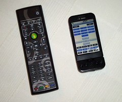
remote controlsI can never find the TV remote.

Whether it’s slipped somewhere in or under the sofa, or been hidden by the kids, I’m often at a loss to find it.

A mobile phone, on the other hand, is rarely too far from my hand 🙂

So I’ve hacked together a quick app to put a TV remote control interface on my phone. It’s definitely a quick-and-dirty chunk of code, but it does now mean that I can work my TV from my mobile if I can’t find the real remote.

On the off-chance that this is useful to other vdr users, I wanted to share how I did it.

(more…)

Book review: Matplotlib for Python Developers

Thursday, February 11th, 2010

Matplotlib for Python Developers, Sandro Tosi

Let me get the boring disclaimer-y bit out of the way first: I didn’t buy this book – Packt Publishing sent me a free copy in return for me writing a review of it. They’ve not made any specific requests about the contents of my review, just that I should write a review. And, in fact, I should give them props for not hassling me for not getting around to writing this until now – about eight weeks after they sent it. So either they forgot they sent it to me, or they are terribly patient. I’m choosing to assume it’s the latter 🙂

With that out of the way… matplotlib is a graphing library. I’ve used it a lot for my CurrentCost energy monitoring app – all of the graphs in the app are created using matplotlib. And while it is very powerful, it can be a little tricky to get your head around. I still struggle with getting the graphs exactly how I want them even now.

That was why I agreed to do this review – I liked the sound of the book and thought it’d be useful for me.

Overall, it’s a really good book. It starts off going through all the basics, both in terms of explaining the ideas and concepts, and in the practical steps needed to get set up. I’m not normally a big fan of reading text books, preferring to figure stuff out for myself as I go along, but found that even here I picked up tips that I never knew and subtle features that I’d missed.

A nice flow-chart kicks off the detail into producing different types of graphs and chart. It starts from asking “What would you like to show?” (e.g. comparison; distribution; composition; relationship; etc.).
Following this through for what you want to show, and what type of data you have, leads you to a suggestion for the type of graph that is most appropriate for your needs (e.g. line histogram; waterfall chart; pie chart; stacked column chart; scatter chart; etc.). For someone like me who doesn’t have the world’s strongest maths background, this was a really useful guide.

(more…)

How much did I spend on electricity to do that?

Friday, November 27th, 2009

Selecting a chunk of a graphTime for number 73 in my never-ending list of ever-so-slightly-different things to try with a graph of home energy usage data

🙂

This time… working out the electricity used (and the cost) of doing… well, something in particular.

We already have live graphs (Switch something on and watch the graph shoot up. Switch it off and watch the line drop.)

And we’ve already got graphs with hourly, daily, or monthly totals.

But if I boil a kettle, how do I know how much that cost?

The live graph shows you the shape of the usage curve for a particular appliance.

What I wanted was to be able to start the live graph running, switch something on, then after it’s finished, go back to the live graph, see the bump in the graph for when I did that, and measure the area under it – giving me my total energy usage for that time.

A quick bit of Python-tinkering later, and here we go

Click-and-drag to highlight a span of the graph, and the Python script calculates the area (more-or-less) under that part of the curve, using this to calculate how much energy I used during this time.

(more…)

What programme was on Channel 4…?

Tuesday, July 28th, 2009

I posted yesterday about my quick play with the BBC Web API for programme schedules. I wanted to be able to programmatically find out what programme was on a particular channel at a given time.

The problem with the quick code I came up with was that it only gets me BBC channels. What if I want to know what was on a non-BBC channel?

Andrew pointed me at the Radio Times website, which makes programme schedule data available in XMLTV format.

And Dom pointed me at a neat Python library for parsing XMLTV data.

(more…)