Archive for the ‘code’ Category

Getting data from the CurrentCost CC128

Saturday, February 7th, 2009

I really need to stop blogging about CurrentCost stuff, this is starting to look like an obsession 🙂

But before I do that, I thought I’d share my experiences in writing a new CurrentCost parser.

What is this all about?
On the off-chance that anyone following me hasn’t already heard about CurrentCost a million times already, CurrentCost meters are domestic electricity monitors that tell you how much electricity your household is using. And they have a connection underneath that lets you grab the data from them.

As well as getting your current electricity usage, you can also get historical usage totals out of the serial port, which I’ve used in a variety of ways, such as in my Python CurrentCost software.

CurrentCost have now brought out a new model of their monitor – the CC128. The data format is different to the current models, so I wanted to try and write a new parser that could handle both the existing model and the new CC128 data.

(more…)

Revisiting my Twitter Glossary

Sunday, January 11th, 2009

Have you ever read someone’s tweet and not known what they are on about?

At IBM HackDay 5, I played around with an idea for a Twitter hack – a Twitter Glossary that would let users define terms they regularly use in tweets. The idea was that followers would see the definitions appearing as tooltips over those words when they appear in tweets.

screenshot of the firefox extension

I described the idea in more detail here. It’s now available for anyone to try.

(more…)

Another CurrentCost app update

Sunday, January 4th, 2009

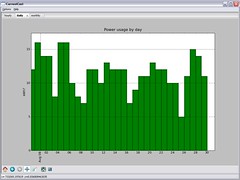
The tabbed interface in my CurrentCost app continues to serve me well. It means I can keep adding new pages to try out new things to display and compare, without spending any time rethinking the interface to make room for another graph.

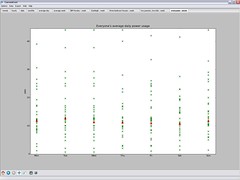
I added another this morning. When you sync the app with the web, it downloads (anonymised) daily power usage values for every registered user, and plots them on a single scatter graph.

I wanted to do this for every stored daily power usage value, but it was unwieldy. I’ve settled for having the web service calculate average daily power usage for each user, and plotting them instead.

plotting everyone's CurrentCost readings on a single scatter graphEach cross on the graph for a day represents a different user, which is neat – a nice way of seeing trends. By plotting my own usage in a different colour, I can see where I am in the distribution.

If you’ve not tried my app yet, please do consider it. The more people I can get submitting data to the web service, the more interesting these graphs become!

Drawing pretty graphs with Open Flash Chart

Friday, December 19th, 2008

I’m keen for young people that Solent Youth Action works with to have access to information about how the charity runs. I’d like for us to be as transparent as possible, and as a geek, one of the ways that I am working on this is by putting more stuff on our website.

We put our Financial Statements online so that people could see where we get our money from, and how we spend it. But it’s a dry document – a twenty-two page PDF of numbers and accounting blurb.

While it is important for this information to be available, it’s not easily accessible to many like this. Tonight I had a play with presenting it as animated online graphs using the awesome Open Flash Chart.

The Open Flash Chart site has very clear tutorials and a ton of examples, so I wont waste time here by going into detail explaining how to use it.

But it’s worth highlighting just how simple it is – drop the swf file into a directory on your webserver, then point it at a JSON file with your data (either by URL, or by reference in your HTML). That’s pretty much it.

The most complicated bit was copying figures out of the Financial Statements document and pasting it into a JSON text file. Even this was fairly quick.

Flash graphs are not as accessible as something like Google Chart images because they require Flash to be installed. However, I hope the visual flair they add makes up for this, and will help grab the attention of our volunteers.

I created a couple of quick charts to show our income and expenditure, but there are many more examples of how to use it here and here.

CurrentCost – setting yourself a personal goal

Sunday, December 14th, 2008

One of the themes that came up at HomeCamp was that collecting data about personal energy usage was good, but putting it in a broader context helped make it more effective.

With that in mind, I thought I’d make a small improvement to my CurrentCost app to add a financial context to the data it displays.

I’ve added the ability to specify an annual electricity usage target – it asks the question “How much do you want to spend on electricity in a year?”

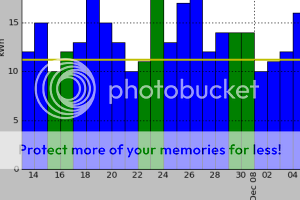
screenshotOnce you answer that, a target line is added to each graph. The target line shows how much electricity you should use in order to meet your goal.

For example, the graph showing daily electricity usage has a horizontal line showing how much electricity usage you can use a day in order to meet your target annual electricity spend. Bars in the graph that are taller than the horizontal line show you exceeding your goal, bars that stay under show you on track.

(more…)

Posting to Twitter… carefully

Thursday, November 13th, 2008

I’ve recently picked up my the code for my Windows Mobile Twitter client again.

It was originally written back in April as a hackday idea. The code posts Twitter updates using a variation on the twitter-from-curl approach of HTTP POSTing “status=MyTweet” to the twitter update url.

I started with the update URL, and appended the message I wanted to tweet. This is fine for a quick hackday demo, but it did mean that you could end up with a URL like:

http://twitter.com/statuses/update.xml?status=Hello (twitter) world! Special chars = a problem?

Which fails if you want to post characters such as accents or characters which have special meaning in URLs, like + ? / & etc.

I was encouraged by a number of users to have another look at this, which I’ve done now, and hopefully version 1.1 solves the problems.

A quick Google turned up that a number of other Twitter apps share at least some of the same problems that mine had, so thought I’d share the fix here.

(more…)

My HackDay hack – see where your friends are

Friday, October 24th, 2008

Today was IBM HackDay 6 – an internal HackDay run across IBM‘s many labs – and I managed to spend a bit of today hacking something together.

PhotobucketIn a nutshell, it’s kinda like Plazes, brightkite, dodgeball and others… find out where your friends currently are. And see where they are from your mobile.

The twist is that it gives you quite precise locations for friends within a known indoor campus – such as Hursley Park.

Hursley, like many IBM locations, is a campus, with thousands of employees in a 100 acre site.

What if you’re trying to find someone? Say you’re in a meeting, and a colleague hasn’t turned up yet. Where are they? Are they on their way?

Or you’ve arranged to meet a colleague for lunch or a coffee, and you seem to keep missing each other.

The idea of this hack was to build on the Hursley Maps tool to come up with some way for you to be able to quickly check where your friends are while you’re at work.

Okay… so it’s a fairly flimsy scenario. 🙂

But I’ve enjoyed playing with location-based services ideas before, and thought this would be an interesting twist. Plus, it was an excuse to play with Django which I’ve wanted to try since hearing about it at BathCamp.

(more…)

Comparing your CurrentCost data with others

Wednesday, October 1st, 2008

a Python CurrentCost appBetween holidays, meetings, work and other stuff, I put CurrentCost stuff to one side for a few weeks.

I’m back now, and thought I’d share my plans for the app. If nothing else, I figure it’s useful for me to refresh my memory and plan my next step!

(more…)